A couple in Nipania moves into their new 3BHK flat. The developer has handed over the flat in standard builder white - flat, neutral, and completely characterless. The master bedroom has two external-facing walls, a window on the eastern side, and marble flooring in a warm off-white tone. They spend two evenings on Pinterest saving bedroom colour ideas. Their shortlist: a deep teal feature wall they saw on a Mumbai interior design account, a lavender and white combination from an Instagram reel, and a warm terracotta and cream combination their neighbour just got done. Before calling a painter, they want to know which of these three will actually look right in their room.
The teal and the lavender both looked beautiful in the photos. In their bedroom - eastern window, warm marble floor, 9-foot ceiling - neither looked the way they expected. The teal read as almost black in the evening. The lavender read as grey-blue during the day and pinkish-purple under their warm LED lights at night. The terracotta and cream looked warm, grounded, and exactly as it had in the neighbour’s flat.
In 45 years of painting bedrooms in Indore, I have repainted more feature walls than I can count - not because the paint failed, but because the colour looked nothing like the picture the homeowner showed me at the start. The picture was taken in a different city, in different light, in a different room. Indore’s indoor light is warm and amber-toned for most of the day. It flatters warm colours and subtly shifts cool colours. Knowing this one fact will save you from repainting your bedroom within a year.
This guide covers the 8 most relevant bedroom colour trends for 2026, assesses each honestly for Indore’s indoor conditions, provides specific colour combination recommendations with paint code references where available, and ends with a practical decision framework for choosing between them.
Why Indore’s Indoor Light Changes Colour - And Why It Matters for Bedroom Choices
Indore’s high UV exterior sunlight, filtered through standard residential windows, produces warm amber-toned indoor light for most of the day. This warm light flatters earthy tones (terracotta, sand, warm white, olive green) and shifts cool tones (lavender, slate blue, cool grey) toward purple, grey-blue, and greenish hues that often do not match online references photographed in northern European natural light.
The physics of warm indoor light: Standard glass windows transmit the full spectrum of sunlight but the UV-filtered, warm-shifted light typical of Indore’s latitude (22.7° N) produces an ambient indoor colour temperature of approximately 3,500-4,500 Kelvin during daylight hours - warmer than the 5,500-6,500 Kelvin of the northern European/coastal daylight in which most interior design photography is shot. This warm ambient light adds yellow-orange tones to every colour on the wall. Cool colours shift warmer. Warm colours are intensified.
How this affects the six colour families:
- Warm neutrals (cream, off-white, warm grey, sand): read exactly as intended - this is why they are the most consistent performers in Indore bedrooms.
- Earthy tones (terracotta, rust, ochre, warm olive): intensified by warm light - often read richer and more saturated than the chip; choose one shade lighter than your intended result.
- Sage green and muted greens: the best-performing cool-adjacent colour in Indore’s light because it has enough yellow in its undertone to remain stable under warm ambient light.
- Cool grey (pure grey without yellow or beige undertone): shifts noticeably purple or blue-grey in warm indoor light - test a patch before committing; choose a greige (grey with beige undertone) instead of a pure cool grey.
- Lavender and purple: the most unpredictable colour family in Indore’s light - shifts pink or red-violet under warm LEDs, blue-grey under cool daylight; only works reliably in rooms with very large east or north-facing windows.
- Deep navy and teal: absorb warm ambient light and read darker and heavier than the chip suggests; only suitable for bedrooms with generous natural light and used as a single accent wall, not full-room.
The artificial light variable: Most Indore bedrooms use warm-white LED downlights or bedside lamps in the 2,700-3,000 Kelvin range - the warmest artificial light commonly available. Under this light, warm tones deepen and become more luxurious; cool tones shift further toward purple, grey-blue, or flat. Any colour that is borderline in natural light will be definitively shifted under bedroom artificial light. Always view the paint patch under both natural and artificial conditions before approving.
The Indore marble floor factor: A majority of Zone 1 and Zone 2 bedrooms have white or off-white marble flooring. Marble reflects light upward onto the walls, adding an additional warm-neutral cast to the lower portion of the wall. Wall colours that work on tiles or hardwood flooring may look different in a marble-floored Indore bedroom. Cool colours in particular can look slightly washed or chalky at the floor level where the marble reflection meets the wall.
Trend 1 - Warm Earth Tones: Terracotta, Clay, and Rust
Warm earth tones - terracotta, clay, rust, and ochre - are the most consistently successful bedroom wall colours in Indore’s residential context. They respond predictably to warm ambient light, complement marble and granite flooring, and pair naturally with the wooden furniture and warm-white linen that dominate Indore’s bedroom aesthetic. The 2026 trend moves these tones toward lighter, dustier versions of classic terracotta.
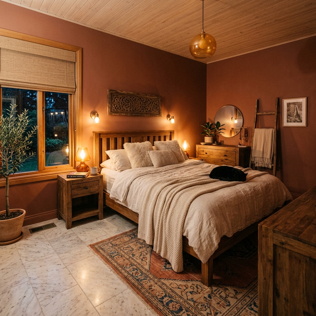
What the 2026 version of this trend looks like: The 2026 version of earth tones has moved away from the deeply saturated, almost burnt terracotta that dominated 2022-2023, toward softer, more washed versions - dusty clay, muted rust, rose-terracotta - that have enough warmth to create a cosy bedroom atmosphere without making the room feel heavy. Think of the colour of aged terracotta pots that have been left in the sun for a few seasons - warm but not vivid, earthy but not dark.
Specific combination that works in Indore:
- Primary: Dusty clay or muted terracotta on the headboard accent wall
- Remaining three walls: Warm white (not bright white - an off-white with a cream or peach undertone)
- Ceiling: Flat white ceiling emulsion
- Why it works in Indore: The dusty clay reads as intended under warm Indore indoor light - slightly intensified, which deepens it from “muted” toward “warm and rich” in the evening, which is when the bedroom is most used. The warm white on the remaining walls reflects warm ambient light around the room, making the space feel cosy rather than cool.
- Asian Paints colour reference: Royale or Royale Matt in “Amber Dust” / “Baked Clay” / “Peach Bisque” range - recommend requesting the physical chip from the Vishwas Homes Pipliyahana showroom before committing.
One shade lighter rule for Indore: Because Indore’s indoor light intensifies warm tones, always choose one shade lighter on the colour chip than your intended final result. If the colour swatch in the showroom looks exactly right, it will look one shade darker on the wall after application. If you want a medium terracotta result, start from a light-to-medium terracotta chip.
Furniture and textile pairings that complete the combination: Natural wood (teak, oak tone, or walnut tone bedroom furniture), warm-white or ivory linen bedding, brass or antique gold fixtures. Avoid chrome or steel accents in an earth-tone bedroom - the cool metal conflicts with the warm wall palette.
Trend 2 - Sage Green and Botanical Tones
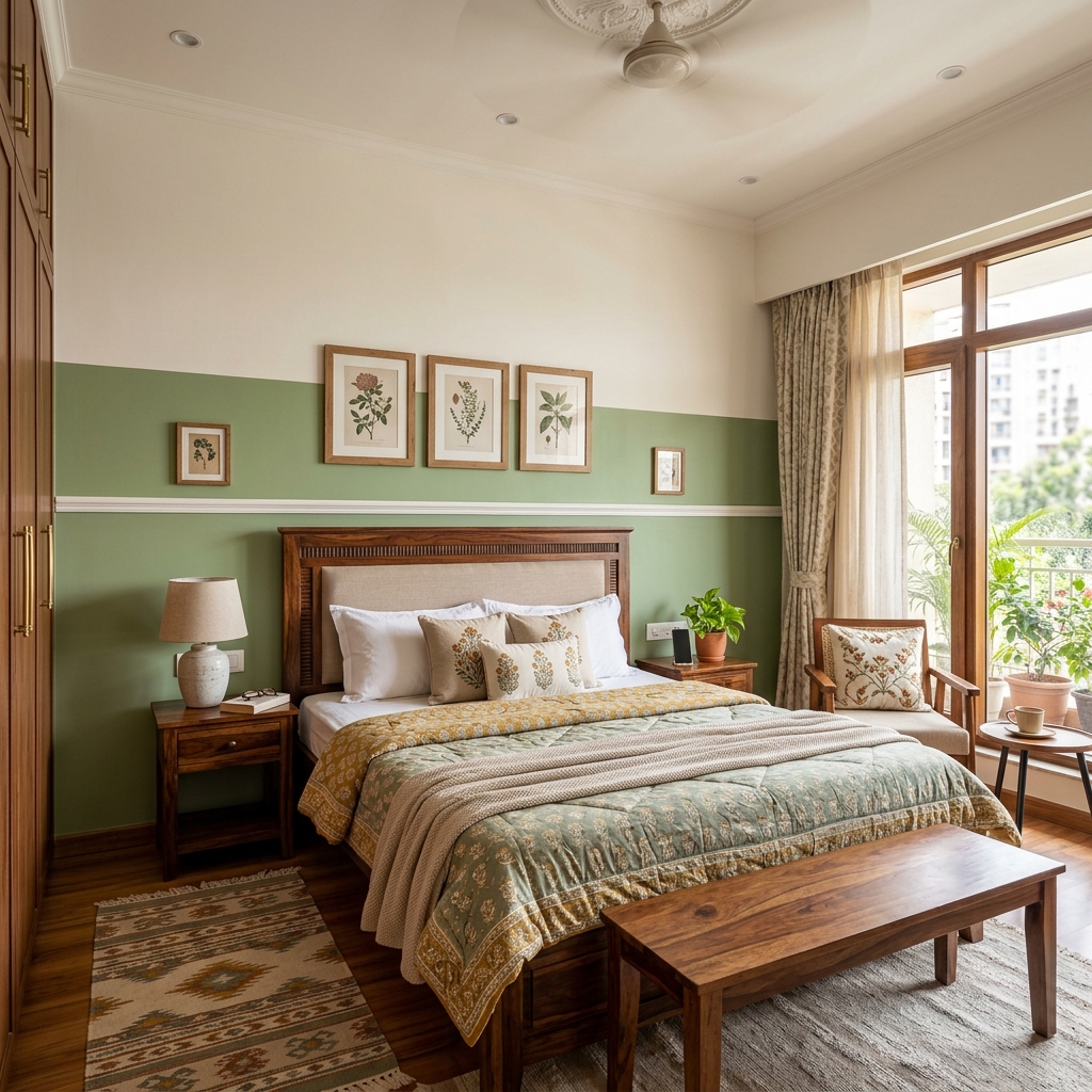
Sage green is the most reliably successful cool-adjacent colour for Indore bedrooms in 2026. Its yellow-green undertone remains stable under warm ambient light, unlike pure cool greens which shift grey or teal. Paired with warm white and natural wood furniture, sage green creates a calming, biophilic bedroom environment that performs consistently across Indore’s varied light conditions.
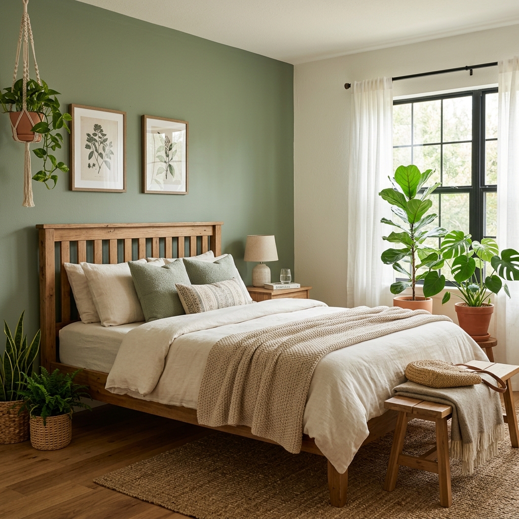
Why sage green works where other greens fail in Indore: Pure cool greens (emerald, forest green without yellow undertone, blue-green) shift toward teal or grey under Indore’s warm ambient light and can look flat or slightly institutional. Sage green - which has a significant yellow-grey undertone - remains stable because the warm light compensates for its cool lean, settling it into a balanced, muted green that reads as nature-referencing rather than chemical. It is one of the only genuinely cool-adjacent tones that performs as expected in Indore bedrooms without requiring a north-facing window or cool artificial lighting.
The 2026 direction of this trend: Sage is moving toward slightly deeper, more olive-toned versions - less pale mint, more aged botanical. The 2026 palette includes muted sage (more grey), warm sage (more olive-yellow), and deep sage (more forest without being dark). All three perform well in Indore but the warm sage and deep sage are the most forgiving of warm ambient light.
Specific combination that works in Indore:
- Primary: Warm sage or muted sage on the headboard accent wall
- Remaining three walls: Warm white or soft cream
- Ceiling: Flat white
- Textiles: Warm white, linen, or dusty blush bedding; natural cane or light wood furniture
- Asian Paints reference: “Sage Whisper” / “Eucalyptus Mist” / “Herbal Mist” range - recommend requesting the physical chip from the Vishwas Homes Pipliyahana showroom before committing.
Full-room sage vs. accent wall: Sage green works as a full-room colour in larger bedrooms (above 180 sq. ft.) with good natural light. In compact Indore apartments under 150 sq. ft., apply sage only on the headboard wall and use warm white on the remaining surfaces to preserve perceived room size.
Trend 3 - Warm Dusty Pink and Blush
Dusty pink and blush wall colours are the strongest trend in master bedroom design in 2026, moving away from the sugary bubble-gum pink of earlier years toward deeply muted, almost neutral rose-beige tones. In Indore’s warm indoor light, dusty pink reads as warm and sophisticated rather than sweet - particularly effective in east-facing bedrooms that receive soft morning light.
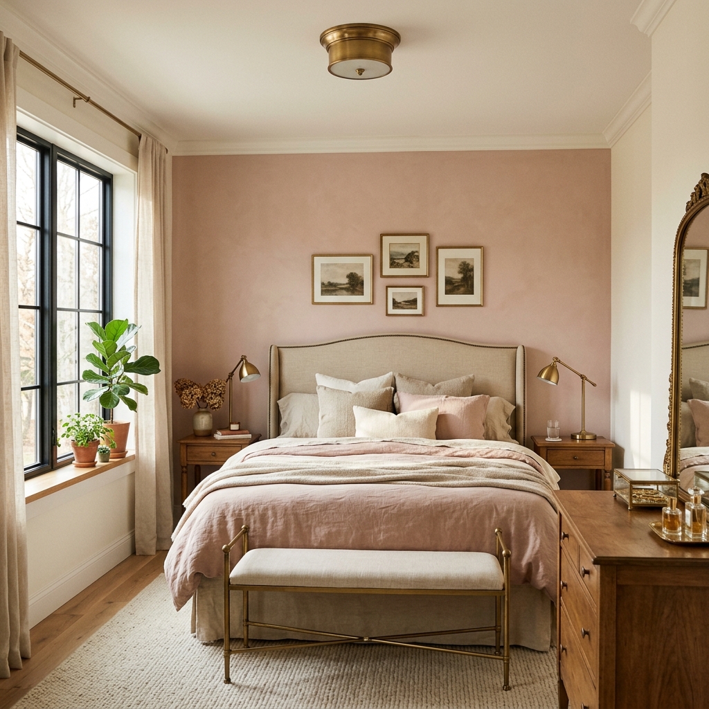
The 2026 version of pink - far removed from the previous trend: The pink that is trending in 2026 is not the millennial pink (coral-pink, clearly pink) of 2017-2019 or the bright rose-gold of 2020-2021. It is a heavily muted, almost neutral blush - closer to a warm greige (grey-beige) with a very faint rose cast. In certain light conditions, it barely reads as pink at all - it presents more as a warm neutral with a flattering rosy warmth. This is what makes it usable by a wide audience, including people who would not consider themselves “pink” bedroom people.
Why this tone works in Indore’s light: Dusty pink and blush have warm undertones (rose, not blue). Under Indore’s warm ambient light, the warmth in these tones is amplified, which deepens the rose cast toward a more sophisticated, blushed warmth rather than a bright sweetness. This is a tone that consistently looks better in Indore’s real indoor conditions than it does under the cool display lighting of paint showrooms or on digital screens.
Specific combination that works in Indore:
- Primary: Dusty blush or muted rose on the headboard wall
- Remaining three walls: Warm white or ivory
- Ceiling: Flat white
- Best for: East-facing bedrooms with soft morning light; master bedrooms for couples; guest bedrooms
- Furniture and textiles: Warm wood tones, antique brass fixtures, white or warm linen bedding; avoid cool grey furniture which creates a cold contrast
- Asian Paints reference: “Rose Quartz” / “Muted Blush” / “Dusty Rose” range - recommend requesting the physical chip from the Vishwas Homes Pipliyahana showroom before committing.
One honest caution for Indore: Under warm LED lighting in the evening, blush pink can shift toward a more red-rose tone - which some homeowners find more romantic and others find too intense. Test the patch specifically under your bedroom’s artificial lighting before approving. A slightly cooler (greyer) blush is safer under warm LEDs than a pure rose blush.
Trend 4 - Warm Charcoal and Moody Darks
Deep, moody wall colours - warm charcoal, deep slate, and dark forest green - are trending in master bedroom design for 2026, but require specific room conditions to succeed in Indore. They work in bedrooms with large windows, high ceilings (10 feet or above), or abundant artificial lighting. In compact, low-ceiling Indore apartments, moody darks absorb available light and make rooms feel enclosed.
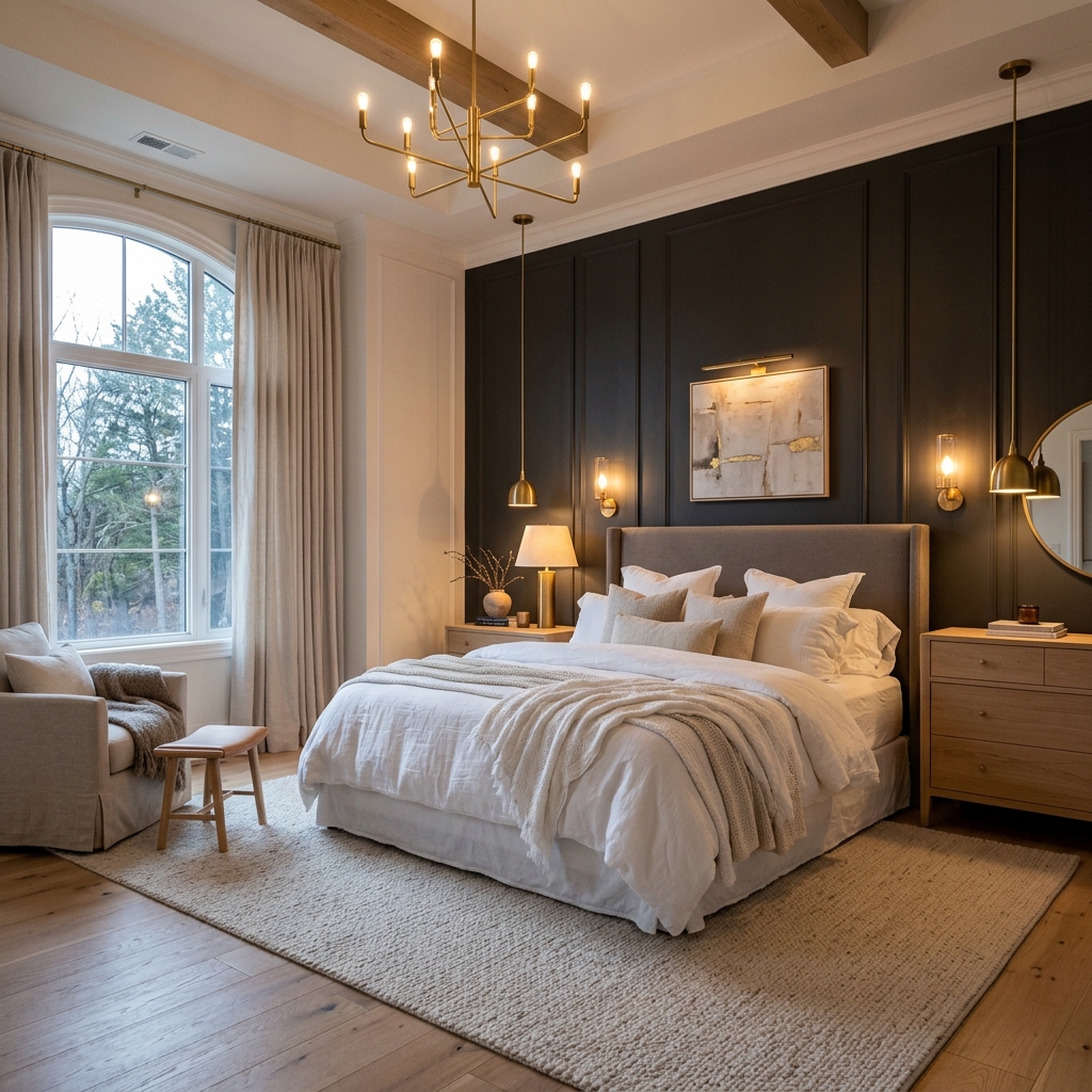
When moody darks work in Indore: This trend is genuine and the results, when conditions are right, are genuinely impressive - a bedroom with a deep warm charcoal headboard wall and ambient brass lighting has an unmistakeable quality of designed luxury. But the conditions required are specific. The bedroom must have: at minimum one large window with reasonable natural light, a ceiling height of 10 feet or above (standard in Zone 2 bungalows; less common in Zone 1 apartments), and a deliberate artificial lighting plan with multiple warm-toned light sources. A single overhead LED pendant in a dark bedroom is not sufficient.
The warm charcoal distinction: The difference between a charcoal that works in Indore and one that makes a room feel like a cave is the undertone. Cool charcoal (grey without any warm cast) reads as cold and heavy in Indore’s warm indoor light - the contrast between the warm ambient light and the cool wall tone creates a flat, slightly oppressive result. Warm charcoal (charcoal with a brown, green, or blue-slate undertone) absorbs the warm ambient light and reads as deep and rich rather than cold and heavy. Always specify warm charcoal - ask for the undertone when selecting a chip.
Specific combination for Indore conditions:
- Primary: Warm charcoal or deep slate on headboard wall only
- Remaining three walls: Warm white or pale warm grey (not cool grey)
- Ceiling: Flat white - never dark; dark ceilings in Indore apartments with 9-foot ceilings create visual compression
- Lighting: Multiple warm-white (2,700K) light sources - bedside lamps, a floor lamp, indirect cove lighting if available
- Furniture: Light wood or rattan balances the dark wall without competing with it; white linen bedding creates a strong contrast anchor
- Asian Paints reference: “Warm Charcoal” / “Pewter” / “Deep Slate” in the Royale Matt range - recommend requesting the physical chip from the Vishwas Homes Pipliyahana showroom before committing.
Who should not choose this trend: Compact bedrooms under 140 sq. ft., rooms with a single small window on the north or west side, and homeowners who have not planned their artificial lighting. Recommend this trend only after seeing the room in person - which is part of the free site consultation Vishwas Homes provides.
Trend 5 - Warm Whites and Layered Neutrals
Warm whites and layered neutral combinations - using two or three closely related warm tones across walls, ceiling, and trim - are the most consistently requested bedroom colour approach in Indore for 2026. They work in every room size, every light condition, and every furniture style, making them the lowest-risk, highest-satisfaction choice for homeowners who want a serene, timeless bedroom.
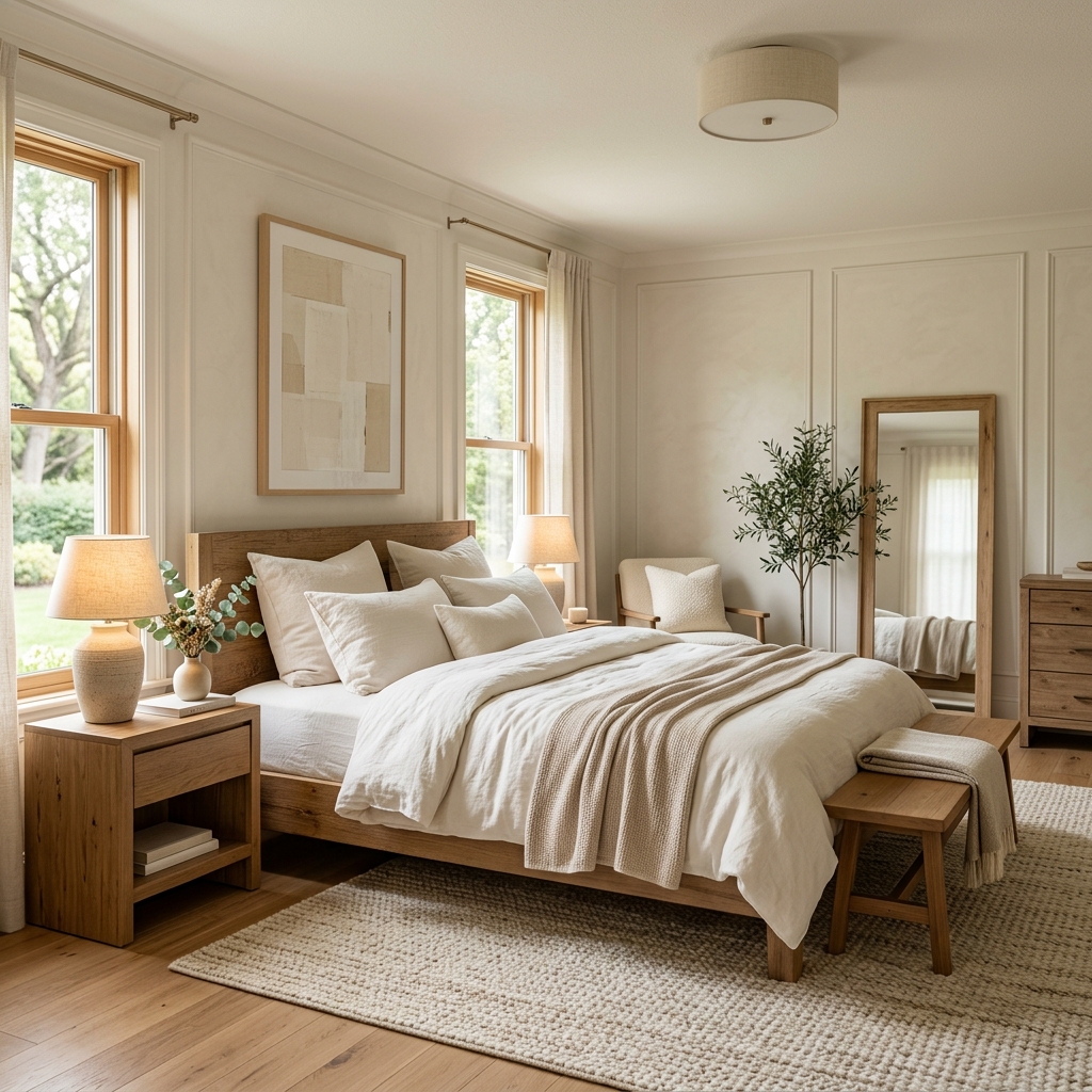
Why this is not “playing it safe” - it is playing it smart: The perception that white or neutral bedrooms are boring or uninspired is based on poorly executed neutrals - rooms where the same flat bright white is applied to every surface with no tonal variation. A layered neutral approach uses intentional variation: a warm cream on the walls, an even warmer ivory at the trim and skirting, a cool-tinted white on the ceiling (which reads as true white next to the warm wall tone), and perhaps a slightly deeper sand or warm stone on the headboard wall. The room has depth, tonal richness, and visual coherence without a single bold colour choice.
The Indore case for warm whites: Indore’s warm indoor light is an ally for warm neutrals. The same warm ambient light that shifts cool tones unpredictably amplifies the warmth and richness of warm whites and creams, making them look inviting and enveloping in the evening rather than bland. A warm white bedroom in Indore’s light at 8 PM, lit by bedside lamps, is genuinely cosy in a way that a cool white or grey bedroom is not.
Specific layered neutral combination:
- Headboard wall: Warm stone or warm sand (one shade deeper than the remaining walls)
- Remaining walls: Warm cream or ivory (not bright white - look for paint chips with a yellow or peach undertone)
- Ceiling: Flat white with the faintest cool undertone - this reads as pure white next to the warm walls and gives the ceiling visual lift
- Skirting and trim: Same warm cream as the walls, or one shade lighter
- Asian Paints reference: “Ivory Mist” / “Cotton Cream” / “Warm Sand” / “Linen White” in the Royale or Royale Aspira range - recommend requesting the physical chip from the Vishwas Homes Pipliyahana showroom before committing.
The texture amplifier: Layered neutrals benefit most from a texture on the headboard wall - an Asian Paints Royale Play sand finish in the warm stone tone adds physical dimension that makes the colour variation legible across the room. Without texture, the tonal difference between the headboard wall and the other walls can be too subtle to read as intentional. For texture choices, explore our Wall Texture Painting Services.
Trend 6 - Indigo and Deep Blue
Deep indigo and navy blue bedroom walls are trending globally in 2026, but require careful execution in Indore’s warm-light context. Indigo reads richest and most accurate in Indore bedrooms with cool white or blue-toned LED lighting and large windows. Under warm amber indoor light, deep navy shifts toward black or very dark purple and can feel heavier than intended.
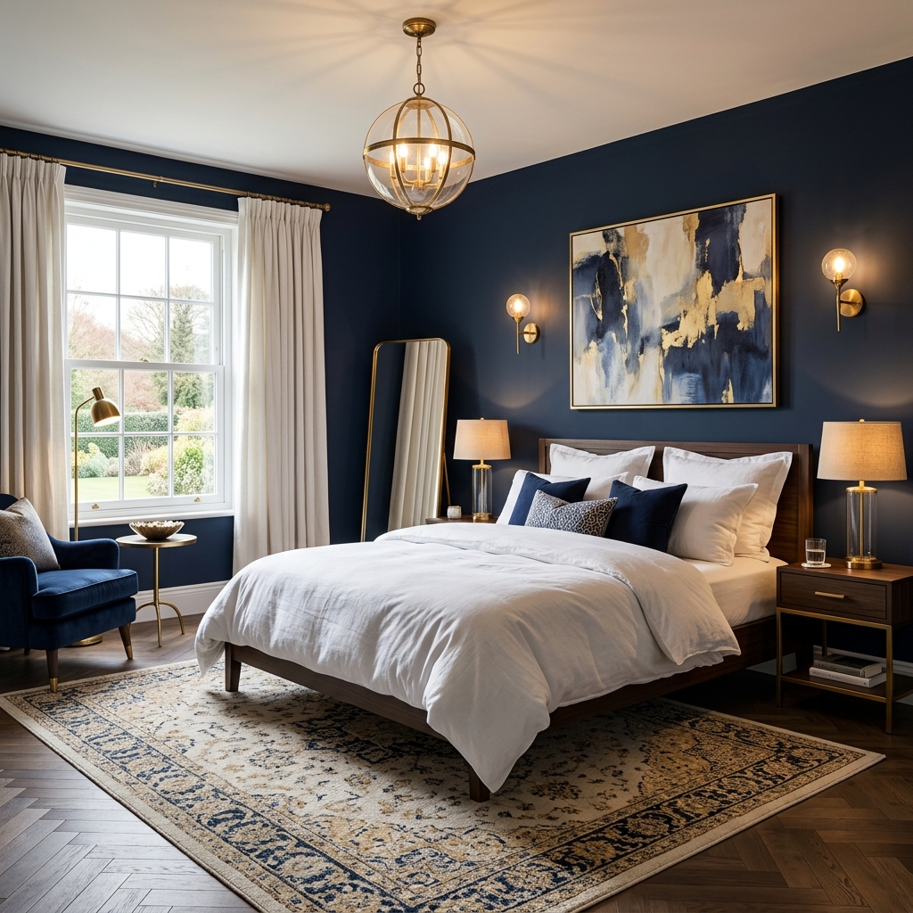
The global appeal and the Indore caveat: Deep blue bedrooms photograph beautifully - the combination of dark walls, white linen, and brass fixtures is one of the most Pinterest-popular bedroom aesthetics in 2026. The caveat for Indore is specific: deep navy under warm 2,700K LED lighting (the most common bedroom lighting in Indore) reads as extremely dark - almost black - and loses the blue-slate quality that makes it attractive in photographs. Under cool 4,000K LED lighting, the same wall reads as rich, deep blue and looks as intended. The choice of artificial lighting determines whether a deep blue bedroom is a success.
Which shade of blue works in Indore: The deep blues that perform best in Indore’s warm-light bedrooms are those with an intentional warmth in their undertone - indigo-blue (with violet lean), ink blue (with a slight grey), or deep teal (with a green lean rather than a pure blue). Pure navy (the classic Pantone-style dark blue without undertone modification) reads as almost black under warm LEDs and should be avoided unless the homeowner is committed to cool artificial lighting throughout the bedroom.
Specific combination:
- Primary: Deep indigo or ink blue on headboard wall only - never full room in a compact Indore apartment
- Remaining walls: Bright warm white (the contrast with the deep wall is what makes the combination work)
- Ceiling: Flat white
- Lighting requirement: Specify to the homeowner that warm LED replacement with 4,000K neutral-white LEDs will be necessary to achieve the intended look
- Asian Paints reference: “Indigo Night” / “Midnight Sky” / “Deep Indigo” in the Royale range - recommend requesting the physical chip from the Vishwas Homes Pipliyahana showroom before committing.
Honest recommendation: “This is the one combination on this list where I always ask the homeowner to show me their bedroom lighting before recommending it. If the existing bedroom lights are warm-white, the deep blue will read as very dark and heavy - not the dramatic, designed look they are aiming for. It is a beautiful combination, but it requires a lighting plan.”
Trend 7 - Earthy Olive and Muted Green-Brown
Earthy olive and muted green-brown tones are among the strongest performing bedroom wall colours in Indore for 2026. With more yellow and brown in their undertone than sage green, olive tones read as grounded, natural, and warm under Indore’s ambient light - performing reliably across different window orientations and both warm and neutral artificial lighting conditions.
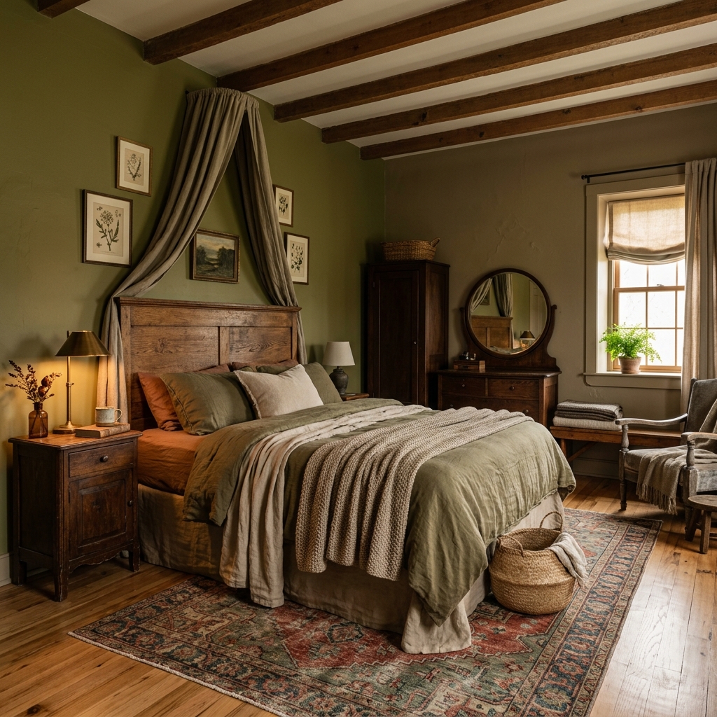
Why olive is more forgiving than sage in Indore’s light: Sage green is muted and slightly grey-green. Olive green is yellow-green-brown - it has more warmth in its base tone. Under Indore’s warm indoor light, olive deepens toward a more antique, slightly bronzed green that reads as rich and intentional. It is less likely to shift in unexpected directions across different light conditions, making it a more consistent choice than sage for rooms where the homeowner is uncertain about their window orientation or artificial lighting setup.
The 2026 olive direction: 2026 olive has moved toward the greenish-brown end of the olive spectrum - sometimes called “army green” in casual reference, but more precisely a desaturated, warm olive with significant brown content. It sits between a natural olive oil colour and a military khaki. This tone is particularly relevant to Indore’s Zone 2 bungalows where a connection to traditional, natural materials is part of the aesthetic.
Specific combination:
- Primary: Muted earthy olive on the headboard wall
- Remaining walls: Warm cream or warm white
- Ceiling: Flat white
- Pairs best with: Dark walnut or teak-toned furniture, brass or antique gold hardware, terracotta or natural clay decorative objects, jute or natural fibre rugs
- Asian Paints reference: “Olive Twig” / “Mossy Trail” / “Earthy Olive” in the Royale Matt range - recommend requesting the physical chip from the Vishwas Homes Pipliyahana showroom before committing.
Who this is for: Homeowners who want a natural, organic-feeling bedroom without using terracotta (which is warmer and more vivid) or sage (which is cooler and more delicate). Olive is the most gender-neutral, furniture-versatile, and light-condition-tolerant of the three earth-adjacent tones - it rarely fails in Indore bedrooms regardless of room size or window orientation.
Trend 8 - Two-Tone Combinations: Colour Blocking for Cosy Bedrooms
Two-tone colour blocking in bedrooms - dividing the wall horizontally into a deeper lower tone and a lighter upper tone - is the most cost-effective way to add designed visual interest to a standard Indore bedroom without changing all four walls. The dividing line at chair-rail height (900mm) or one-third of the wall height creates a grounded, cosy effect that works in both compact apartments and larger bungalow bedrooms.
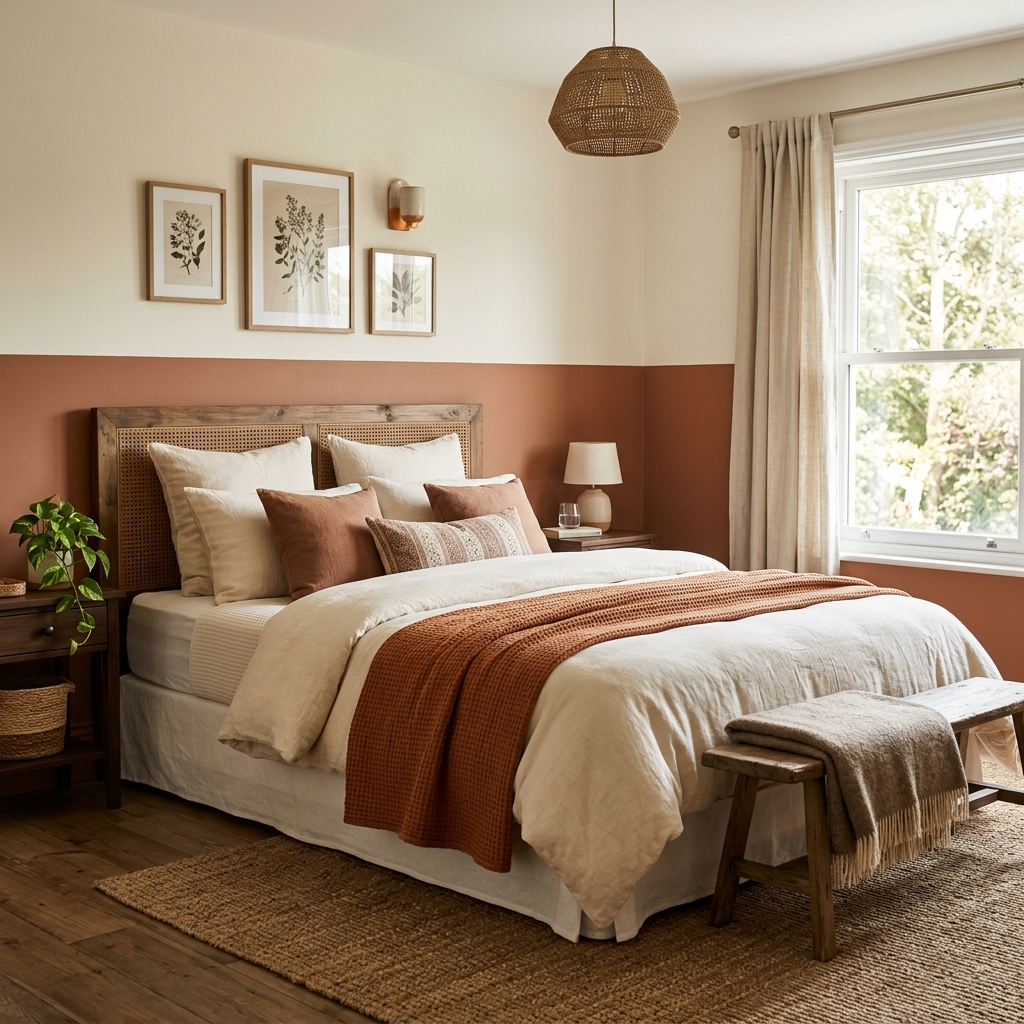
Why two-tone works specifically for cosy bedrooms: A bedroom wall with a deeper lower tone visually lowers the room’s visual centre of gravity - the eye is drawn to the mid-to-lower portion of the wall rather than upward. This creates a subconsciously cosy, sheltered feeling that is distinct from the open, airy feeling of all-white walls. The effect is more pronounced in bedrooms than in living rooms because bedrooms are used primarily in the evening and horizontal colour banding reads well under the lower, softer artificial lighting typical of bedroom use.
Combination 1 - Terracotta lower / warm white upper:
- Dividing line: At 900mm (chair-rail height)
- Lower: Dusty terracotta or muted clay
- Upper: Warm white
- Works in: All Indore bedroom sizes and light conditions
- Estimated cost: ₹6,500-9,000 including professional labour for a standard 12x10 ft bedroom (four walls)
Combination 2 - Deep olive lower / cream upper:
- Dividing line: At 1,050-1,200mm (slightly higher than chair-rail - works in bedrooms with 9-foot ceilings)
- Lower: Earthy olive or muted khaki
- Upper: Warm cream or ivory
- Works in: Master bedrooms, guest bedrooms; pairs naturally with wooden furniture
- Estimated cost: ₹7,000-9,500 including professional labour
For the step-by-step masking tape technique to achieve a clean dividing line, read our guide on budget-friendly accent wall techniques.
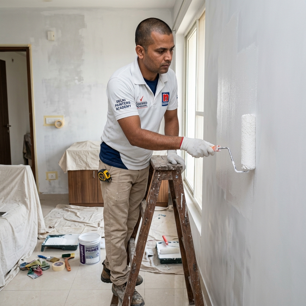
To ensure your new paint job lasts as long as possible, always focus heavily on surface preparation before painting.
For guaranteed results and flawless execution, consider professional Interior House Painting Services.
How to Choose Between These 8 Trends for Your Specific Bedroom
The correct bedroom wall colour for an Indore home depends on four factors: the room’s primary window orientation (east, west, north, or south-facing), ceiling height, flooring tone (marble, granite, or tile), and the warmth of the existing or planned artificial lighting. No single colour trend is universally right - these four variables determine which trend will perform as intended.
Step 1 - Identify your window orientation:
- East-facing bedroom (morning light): all eight trends work; moody darks and deep blues are more viable here than in any other orientation because the morning light provides a daily reset.
- West-facing bedroom (afternoon sun, warm late-day light): avoid cool tones entirely - use only warm earth tones, sage, olive, or warm white combinations.
- North or south-facing bedroom (diffused, consistent light): the safest orientation for testing slightly cooler tones - sage and dusty blush are more predictable here.
Step 2 - Assess your ceiling height:
- 9-foot ceiling (most Vijay Nagar and Nipania apartments): avoid moody darks on more than one wall; avoid very deep colours on all four walls; two-tone colour blocking is particularly effective at adding cosiness without reducing perceived height.
- 10-foot ceiling and above (most Zone 2 bungalows): all trends are viable; moody darks and full-room sage are more feasible at this height.
Step 3 - Check your flooring tone:
- Warm white or off-white marble: warm earth tones, sage, olive, and warm neutrals all coordinate naturally; avoid cool grey which creates a jarring transition at floor level.
- Dark granite or dark stone: bold contrasts work here - deep indigo, deep olive, or terracotta all read as intentional against a dark floor.
- Neutral vitrified tile: the most flexible backdrop - all trends are viable.
Step 4 - Decide before you paint: Order two or three paint sample pots of your shortlisted colours. Apply a 30x30 cm patch of each on the actual headboard wall. View the patches at three different times: mid-morning, afternoon, and evening under your planned artificial lighting. The patches that look right across all three conditions are your final candidates. Do not approve a colour from a chip alone.
FAQ Section
Which wall colour is trending for bedrooms in Indore in 2026?
Warm earth tones - dusty terracotta, muted clay, warm olive - are the most consistently requested bedroom colours in Indore in 2026. Sage green is the strongest cool-adjacent trend, while warm charcoal is growing in larger bungalow master bedrooms. The global trend for deep indigo and navy requires careful lighting planning to succeed in Indore’s warm-light indoor conditions.
What colour should I paint my bedroom walls to make it feel cosier?
Two-tone colour blocking with a warmer, slightly deeper lower panel and a warm white upper section is the most effective cosy-bedroom technique for Indore apartments. The deeper lower tone grounds the room visually and creates a sheltered atmosphere. Recommended combinations: terracotta lower / warm white upper, or earthy olive lower / cream upper. This costs ₹6,500-9,500 for a standard 12x10 ft bedroom including professional labour.
Will a dark bedroom wall make my room look smaller in an Indore apartment?
Yes - in a compact bedroom under 150 sq. ft. with a standard 9-foot ceiling, a dark colour on all four walls will reduce perceived room size significantly. The correct approach is one dark accent wall - the headboard wall only - with warm white on the remaining three walls and a white ceiling. This creates the dramatic contrast of a dark feature wall without enclosing the space.
What is the best two-colour combination for a master bedroom wall in Indore?
The most consistent two-colour combination for Indore master bedrooms is: dusty terracotta or muted clay accent wall (headboard wall) combined with warm white on the three remaining walls. This combination works in all light conditions, pairs with both modern and traditional bedroom furniture, complements Indore’s typical marble flooring, and remains current without being trend-dependent.
Does grey work as a bedroom wall colour in Indore?
Cool pure grey is the most unreliable colour choice for Indore bedrooms - it shifts toward purple, lavender, or blue-grey under warm indoor light. If grey is the preference, specify a greige: a grey with a beige or brown undertone that remains stable under warm ambient light. Request “warm grey” or “taupe grey” on the colour chip rather than “cool grey” or “neutral grey”. Always test a 30x30 cm patch under your bedroom’s artificial lighting before committing.
How much does bedroom wall painting cost in Indore with a colour change?
For a standard 3BHK master bedroom - four walls, two coats, colour change from existing - professional painting with surface preparation and premium emulsion: ₹8,000-14,000 depending on room size and paint grade. A single accent wall colour change: ₹2,500-4,500. Vishwas Homes provides a transparent itemised quote including materials from our Pipliyahana showroom with a written warranty. Schedule a free site visit and quote - WhatsApp 070672 58993.
Conclusion: A Practical Colour Selection Guide Before You Call Your Painter
After 45 years of painting bedrooms in Indore - from compact Vijay Nagar apartments to sprawling Palasia bungalows - the one piece of advice I give every homeowner before a colour decision is this: what looks right in a photograph is not the same as what will look right in your room. Your room has specific light, specific flooring, specific proportions, and specific artificial lighting. Those four variables determine which of these eight trends will succeed and which will need a second look.
Before calling a painter, answer these four questions about your bedroom: Which direction does your primary window face? What is your ceiling height? What colour is your flooring? What is the colour temperature of your bedroom lighting? If you cannot answer the lighting colour temperature question, look at the LED packaging - it will say 2,700K (warm white), 4,000K (neutral white), or 6,500K (cool white / daylight). Most Indore bedrooms use 2,700K. This single number significantly determines which colours on this list will perform as expected.
If you are in Indore and want to see physical colour samples in your actual bedroom before making a decision, WhatsApp us at 070672 58993 or book a free site visit and quote. We bring physical paint chips, show you a portfolio of completed bedroom projects across Vijay Nagar, Palasia, and Nipania, and give you a transparent written quote before any commitment. Since 1980, helping Indore bedrooms look the way their owners imagined.

About the Author: Rajesh Vishwas
Rajesh Vishwas has been a leading figure in Indore’s painting and waterproofing trade since 1980. With 45 years of hands-on experience, Rajesh specializes in delivering high-quality, durable interior finishes and resolving complex wall preparation issues for families across Indore.